


![[Guest Post] Survival of the Savviest: Actionable Website Strategies for Small Businesses in Tough Times](https://static.wixstatic.com/media/24bff7_9eaf5fe147aa45dfad5f848a9d30ef96~mv2.png/v1/fill/w_604,h_604,fp_0.50_0.50,q_35,blur_30,enc_avif,quality_auto/24bff7_9eaf5fe147aa45dfad5f848a9d30ef96~mv2.png)
![[Guest Post] Survival of the Savviest: Actionable Website Strategies for Small Businesses in Tough Times](https://static.wixstatic.com/media/24bff7_9eaf5fe147aa45dfad5f848a9d30ef96~mv2.png/v1/fill/w_148,h_148,fp_0.50_0.50,q_95,enc_avif,quality_auto/24bff7_9eaf5fe147aa45dfad5f848a9d30ef96~mv2.png)


Dashboard Design Principles
- Visual Design Studio

- Sep 16, 2020
- 4 min read
Updated: Nov 10, 2020
Use UX Design to make dashboards deliver insights FAST
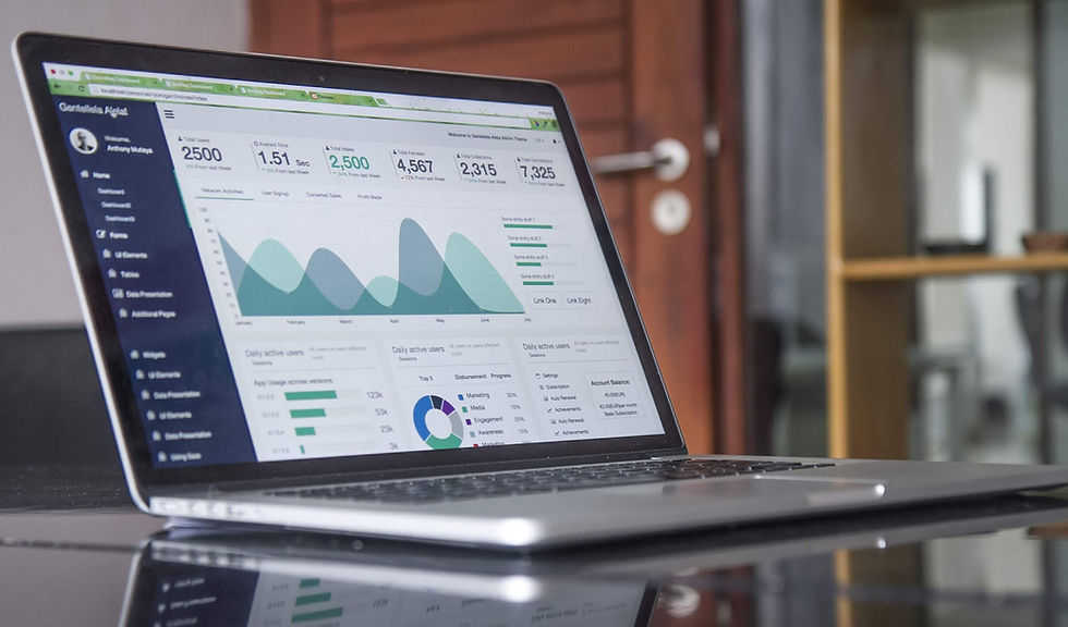
What is UX? Why Should We Care About UX Principles in Dashboard Design?
Simpler Answer: UX stands for User Experience. We care because dashboard is for users to see and we want to create a nice experience that effectively delivers the insights to our audience.
Longer Answer: UX is not just visually appealing images, rather it emphases on the usability and the EXPERIENCE. Therefore, it is about creating a user-centred journey, starting from their first glimpse of the design until their attentions are drawn by something else. UX design is crucial for data visualization because information dashboards are getting more usage beyond just for business intelligence or data analysis professionals. Nowadays, it serves the need of everyone, either technical or non-technical, on a daily basis. For example, when you open your fitness app, there are dashboards that track down your exercises over time. When you check at your activities on social media apps, that's also data visualization.

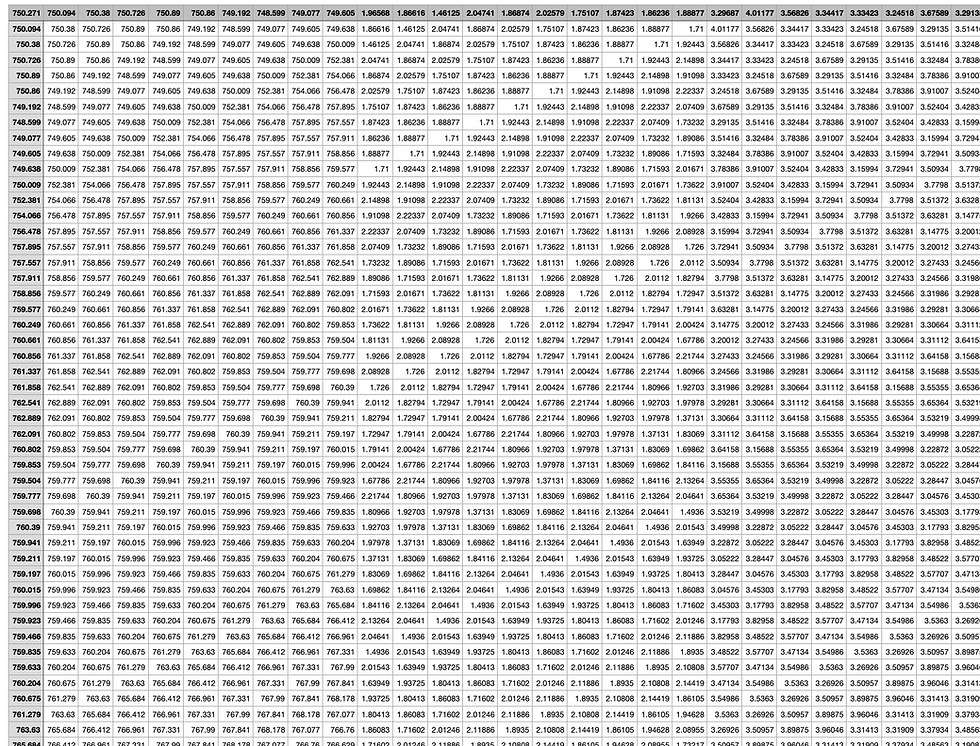
Sometimes it is just painful, and I know that your brain is screaming when you see massive data like this. Definitely, you wouldn't say that is good user experience. That's why we need better visuals to summarise the data and tell us what is important within 5 seconds.
If you would love to know more about how to perform data preparation on messy data like this before building the dashboard, check out this article:
Three UX Design Principles for Better Dashboard
1. Just KISS
I am sorry it is not what you are thinking ;)
KISS means "keep it simple, stupid". Good user experience doesn't mean stacking all the beautiful graphics together. It looks amazing, but your attention is dispersed everywhere on the screen, and to be honest, it is tiring. It is also not about creating complicated graphs that show off how scientific and professional they look, that only scare people off.
There are some graphs we’d better avoid using based on this principle. For example, only use 3D chart if it is really necessary. Most of the time, the third dimension just doesn’t serve any purpose. Instead, it makes the visuals so heavy and thick to digest.

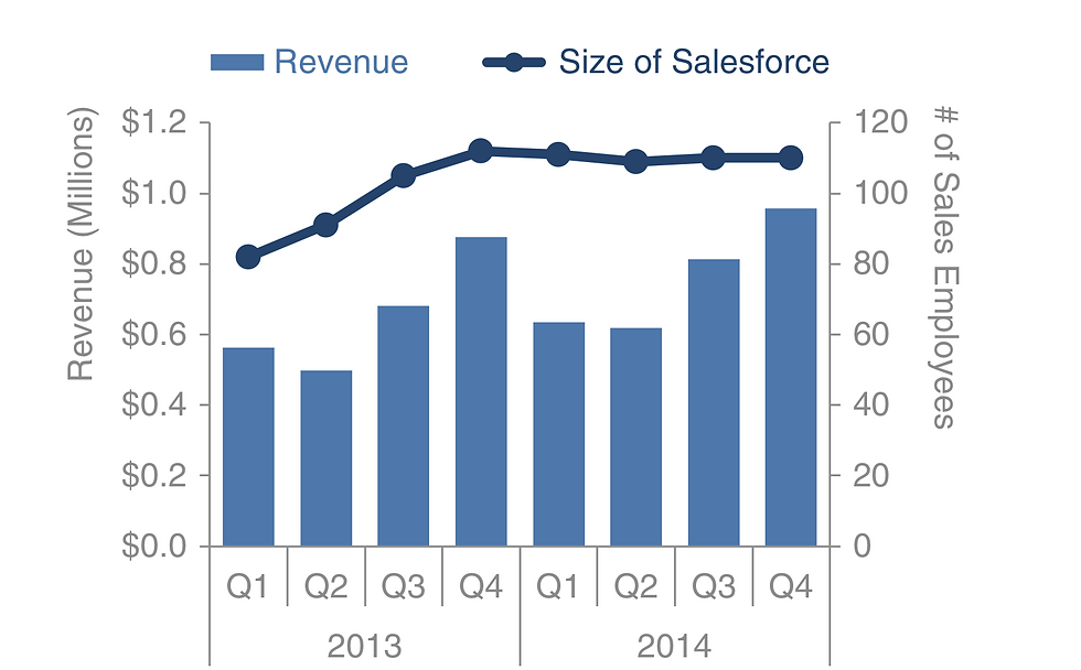
Another example is secondary y-axis, it takes more frictions and efforts to understand which axis the chart is mapped against. Like this chart below, can you easily tell which axis is for the bar chart and which one is for the line chart within 3 seconds?
Therefore, keep it minimal and eliminate clutter, these simple tricks can additionally make your dashboard looks cleaner instantly:
1. Use no more than five colours (or 3 main colours) in one dashboard.
2. Un-bold chart captions and titles. Make them concise.
3. Remove chart gridlines and borders.
Delivering knowledge is not about showing off how skilled you are, rather it is to highlight common understanding between deliverers and receivers. Just KISS!
2. Forms Follow Functions

Built upon the previous point, one of the key dashboard design principles is to successfully deliver the message to the receivers. Therefore we need to prioritize what are the core functions and insights the dashboard needs to demonstrate. Then choose the forms correspondingly. Emphasize on selecting the most appropriate chart that is aligned with the data type.
Bar chart compares the measures of categorical data.

Histogram looks very similar to the bar chart because it also consists of bars. However, instead of comparing the categorical data, it breaks down a numeric data into interval groups and shows the frequency of data fall into each group.

Line chart indicates trend and development of variables over time, usually represented by one numeric data against a date-type variable. It is commonly used in time series analysis.
Pie chart is used to represent the percentage and weight of categorical data. Intuitively depict proportions of a whole.

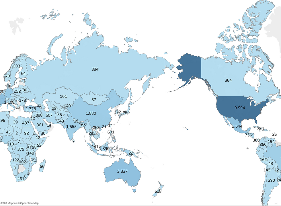
Map shows numeric data that can be grouped by regions. Using gradient colors is a great way to visualize the density difference in various geographical locations.
Scatter plot visualizes the correlation between two numeric variables. Common to identify relationships such as linear regression, logistic regression etc.

These are the most basic charts. There are more complicated graphs that perform advanced analytics such as heatmap, treemap, box plot etc ... That's another story that is definitely worth diving deeper. However, it is not the main focus of this article.
The key message is to always keep the users in mind and be clear about the objectives. It doesn’t matter how fancy the form is if it doesn’t bring any functions.
3. Take the Advantage of Hierarchy
The last dashboard design principle is to use hierarchy. Hierarchy is essential in terms of indicating viewers where to look first. It can be constructed implicitly using size, color, position etc.
Size: Large and bold fonts are more likely to stand out whereas small and thin texts are less prioritised. If we are using texts to display statistics, make sure they do pop up from other text forms such as title and caption. For example, using a different color to represent 3 in "3 UX Design Principles" makes the digit stand out. This principle goes beyond just text, using different sizes of shape also creates a hierarchical layout.

Position: Human visual perception determines that we are more likely to look at the top left corner or the center of the screen. Therefore, the most important information should be located at these areas where viewers distribute most of their attention.
Color: Bright colors are more likely to stand out whereas pale colors will be brought to the background. Another general rule is that color that breaks the consistency will be perceived as important message. Therefore, make use of contrast to make the key information grab your audience's attention.

Take-Home Message
In this article, I summarized three UX design principles that also applies to dashboard design. They are KISS (keep it simple and stupid), form follows function and take advantage of hierarchy. Most importantly is to always keep the users in mind and deliver clear messages for them. Be more empathetic and create a smooth experience that highlights the common understanding between deliverers and receivers.
More Resources
"Storytelling with Data" is an amazing book that discusses many dashboard design principle in depth. Here is the link to download the pdf for free http://www.bdbanalytics.ir/media/1123/storytelling-with-data-cole-nussbaumer-knaflic.pdf, or check out their website http://www.storytellingwithdata.com/


I had a chance to work on a multilingual project that included Hungarian, and finding a font that handled it beautifully was a challenge and until I came across this one. It supports the language perfectly while maintaining a modern and clean aesthetic. The cultural nuances in the style are subtle but meaningful. I recommend hungarian font for projects where both linguistic support and visual consistency are essential.