


![[Guest Post] Survival of the Savviest: Actionable Website Strategies for Small Businesses in Tough Times](https://static.wixstatic.com/media/24bff7_9eaf5fe147aa45dfad5f848a9d30ef96~mv2.png/v1/fill/w_604,h_604,fp_0.50_0.50,q_35,blur_30,enc_avif,quality_auto/24bff7_9eaf5fe147aa45dfad5f848a9d30ef96~mv2.png)
![[Guest Post] Survival of the Savviest: Actionable Website Strategies for Small Businesses in Tough Times](https://static.wixstatic.com/media/24bff7_9eaf5fe147aa45dfad5f848a9d30ef96~mv2.png/v1/fill/w_148,h_148,fp_0.50_0.50,q_95,enc_avif,quality_auto/24bff7_9eaf5fe147aa45dfad5f848a9d30ef96~mv2.png)


Dynamic EDA for Qatar World Cup Teams
- Visual Design Studio

- Dec 10, 2022
- 4 min read
Updated: Feb 22, 2023
How to Use Plotly for Insightful Data Explorations
This article will introduce the tool, Plotly, that brings data visualization and exploratory data analysis (EDA) to the next level. You can use this open source graphing library to make your notebook more aesthetic and interactive, regardless if you are a Python or R user. If your notebook hasn't got Plotly pre-installed, use the statement "!pip install --upgrade plotly".
We will use the “Historical World Cup Win Loose Ratio Data” to analyze the teams participated in Qatar World Cup 2022. The dataset contains the wins, looses and draw ratio between each "country1-country2 pair". For example, the first row gives us the information that among 7 games played between Argentina and Australia, the ratio of wins, looses and draws by Argentina is 0.714286, 0.142857 and 0.142857 respectively.
df = pd.read_csv('/kaggle/input/qatar2022worldcupschudule/historical_win-loose-draw_ratios_qatar2022_teams.csv')
Box plot, bar chart, choropleth map and heatmap will be utilized for data visualization. Furthermore, we will also introduce advanced Pandas functions that are tied closely with these visualization techniques, including:
aggregation: df.groupby()
sorting: df.sort_values()
merging: df.merge()
pivoting: df.pivot()
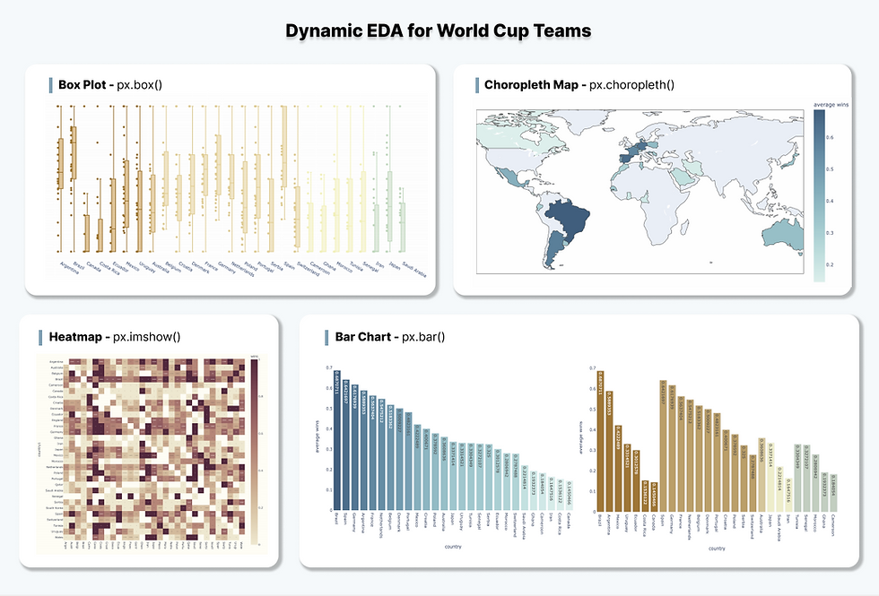
Box Plot - Wins Ratio by Country
The first exercise is to visualize the wins ratio of each country when playing against other countries. To achieve this, we can use box plot to depict the distribution of wins ratio for each country and further colored by the continents of the country.
Hover over the data points to see the detail information and zoom in box plots to see the max, q3, median, q1 and min values.
Let’s breakdown how we built the box plot step-by-step.
1. get continent data
From the original dataset, we can use the fields “wins” and grouped by “country1” to investigate how the value varies within a country as compared to across countries. To further explore whether the wins ratio is impacted by continents, we need to introduce the "continent" field from the plotly built-in dataset px.data.gapminder()
geo_df = px.data.gapminder()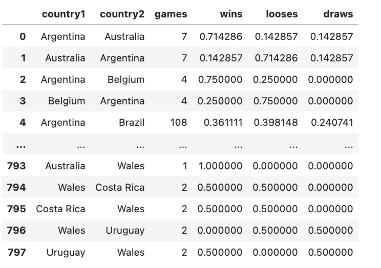
(Here I am using “continent” as an example, feel free to play around with “lifeExp” and “gdpPercap” as well)
Since only continent information is needed, we drop other columns to select distinct records using drop_duplicates().
continent_df = geo_df[['country', 'continent']].drop_duplicates()We then merge the geo_df with original dataset df to get the continent information. If you have used SQL before, then you will be familiar with how table joining/merging works. df.merge() works the same way by combining the common fields in df (i.e. “country1”) and continent_df (i.e. “country”).
continent_df = geo_df[['country', 'continent']].drop_duplicates()
merged_df = df.merge(continent_df, left_on='country1', right_on='country')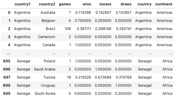
2. create box plot
We apply px.box function and specify the following parameters that describe the data fed into the box plot.
fig = px.box(merged_df,
             x='country1',
             y='wins',
             color='continent',
...
3. format the plot
Following parameters are optional but help to format the plot and display more useful information in the visuals.
fig = px.box(merged_df,
             x='country1',
             y='wins',
             color='continent',
# formatting box plot
             points='all',
             hover_data=['country2'],
             color_discrete_sequence=px.colors.diverging.Earth,
             width=1300,
             height=600
            )
fig.update_traces(width=0.3)
fig.update_layout(plot_bgcolor='rgba(0,0,0,0)')
points = ‘all’ means that all data points are shown besides the box plots. Hover each data point to see the details.
hover_data=['country2'] added “country2” to the hover box content.
color_discrete_sequence=px.colors.diverging.Earths specifies the color theme. Please note that color_discrete_sequence is applied when the field used for coloring is discrete, categorical values. Alternatively, color_continuous_scale is applied when the field is continuous, numeric values.
width=1300 and height=600 specifies the width and height dimension of the figure.
fig.update_traces(width=0.3) updates the width of each box plot.
fig.update_layout(plot_bgcolor='rgba(0,0,0,0)') updates the figure background color to transparent.
Bar Chart - Average Wins Ratio by Country
The second exercise is to visualize the average wins ratio per country and sort them in descending order, so that to see the top performed countries. We can use the code below to achieve these three things:
df.groupby(['country1']): grouped the df by field “country1”.
[’wins’].mean(): take the mean of “wins” values.
sort_values(ascending=False): sort the values by descending order.
average_score = df.groupby(['country1'])['wins'].mean().sort_values(ascending=False)We then use pd.DataFrame() to convert the average_score (which is Series datatype) to a table-like format.
average_score_df = pd.DataFrame({'country1':average_score.index, 'average wins':average_score.values})Feed the average_score_df to px.bar() function and it follows the same syntax as px.box(). Except that we use color_continuous_scale to choose the color palette because this time the plot is colored by a continuous, numeric field “average wins”.
# calculate average wins per team and descending sort
fig = px.bar(average_score_df,
             x='country1',
             y='average wins',
             color='average wins',
             text_auto=True,
             labels={'country1':'country', 'value':'average wins'},
             color_continuous_scale=px.colors.sequential.Teal,
             width=1000,
             height=600
            )
fig.update_layout(plot_bgcolor='rgba(0,0,0,0)')
To take a step further, we can also group the bar based on continent to illustrate the top performing countries as per continent, using the code below.
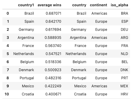
# merge average_score with geo_df to bring "continent" and "iso_alpha"
geo_df = px.data.gapminder()
geo_df = geo_df[['country', 'continent', 'iso_alpha']].drop_duplicates()
merged_df = average_score_df.merge(geo_df, left_on='country1', right_on='country')

# create box plot using merged_df and colored by "continent"
fig = px.bar(merged_df,
             x='country1',
             y='average wins',
             color='average wins',
             text_auto=True,
             labels={'country1':'country', 'value':'average wins'},
             color_continuous_scale=px.colors.sequential.Teal,
             width=1000,
             height=600
            )

fig.update_layout(plot_bgcolor='rgba(0,0,0,0)')
Choropleth Map - Average Wins Ratio by Geo Location
The next visualization we are going to explore is to display the average wins ratio of the country through the map. The diagram above gives us a clearer view of which areas around the world had relatively better performance, such as South Americas and Europe.
ISO code is used to identify the location of the country. In the previous code snippet, we have merged geo_df with original dataset. The screenshot shows the first 5 rows of the merged_df.
We then use px.choropleth() function and define the parameter locations to be “iso_alpha”.
fig = px.choropleth(merged_df,
                    locations='iso_alpha',
                    color='average wins',
                    hover_name='country',
                  color_continuous_scale=px.colors.sequential.Teal,
                    width=1000,
                    height=500,
                   )
fig.update_layout(margin={'r':0,'t':0,'l':0,'b':0})
Heatmap - Wins Ratio Between Country Pairs
Lastly, we will introduce heatmap to visualize the wins ratio between each country pair, where the dense area shows that countries on the y axis had a higher ratio of wining. We need to use df.pivot() function to reconstruct the dataframe structure. The code below specifies the row of the pivot table to be “country1”, “country2” as the columns and keep the “wins” as the pivoted value. As the result, the table on the top has been transformed into the bottom one.
df_pivot = df.pivot(index = 'country1', columns ='country2', values = 'wins')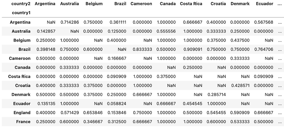
We then use the pivoted_df and px.imshow() to create the heatmap.
# heatmap
fig = px.imshow(pivoted_df,
                text_auto=True,
                labels={'color':'wins'},
                color_continuous_scale=px.colors.sequential.Brwnyl,
                width=1000,
                height=1000
               )
fig.update_layout(plot_bgcolor='rgba(0,0,0,0)')
Hope you found this article helpful. If you’d like to support my work and see more articles like this, treat me a coffee ☕️ by signing up Premium Membership with $10 one-off purchase.
Take-Home Message
Plotly has provided us the capability to create dynamic visualizations and generates more insights than a static figure. We have used the trending World Cup data to explore following EDA techniques:
Box Plot
Bar Chart
Choropleth Map
Heatmap
We have also explained advanced Pandas functions for data manipulation, which has been used applied in the EDA process, including:
aggregation: df.groupby()
sorting: df.sort_values()
merging: df.merge()
pivoting: df.pivot()


Comments