


![[Guest Post] Survival of the Savviest: Actionable Website Strategies for Small Businesses in Tough Times](https://static.wixstatic.com/media/24bff7_9eaf5fe147aa45dfad5f848a9d30ef96~mv2.png/v1/fill/w_604,h_604,fp_0.50_0.50,q_35,blur_30,enc_avif,quality_auto/24bff7_9eaf5fe147aa45dfad5f848a9d30ef96~mv2.png)
![[Guest Post] Survival of the Savviest: Actionable Website Strategies for Small Businesses in Tough Times](https://static.wixstatic.com/media/24bff7_9eaf5fe147aa45dfad5f848a9d30ef96~mv2.png/v1/fill/w_148,h_148,fp_0.50_0.50,q_95,enc_avif,quality_auto/24bff7_9eaf5fe147aa45dfad5f848a9d30ef96~mv2.png)


Semi-Automated Exploratory Data Analysis Process in Python
- Visual Design Studio

- Feb 28, 2021
- 9 min read
Updated: Feb 1, 2022
An Exploration on the "Medium" Dataset Using Pandas and Seaborn
Exploratory Data Analysis, also known as EDA, has become an increasingly hot topic in data science. Just as the name suggests, it is the process of trial and error in an uncertain space, with the goal of finding insights. It usually happens at the early stage of the data science lifecycle. Although there is no clear-cut between the definition of data exploration, data cleaning, or feature engineering. EDA is generally found to be sitting right after the data cleaning phase and before feature engineering or model building. EDA assists in setting the overall direction of model selection and it helps to check whether the data has met the model assumptions. As a result, carrying out this preliminary analysis may save you a large amount of time for the following steps. In this article, I have created a semi-automated EDA process that can be broken down into the following steps:
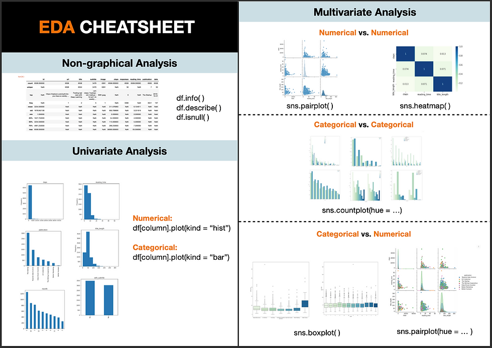
Know Your Data
Data Manipulation and Feature Engineering
Univariate Analysis
Multivariate Analysis
Feel free to jump to the part that you are interested in, or grab a code snippet at the end of this article if you find it helpful.
1. Know Your Data
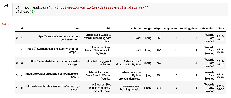
Firstly, we need to load the python libraries and the dataset. To make this EDA exercise more relatable, I am using this Medium dataset from Kaggle. Thanks to Dorian Lazar who scrapped this amazing dataset that contains information about randomly chosen Medium articles published in 2019 from these 7 publications: Towards Data Science, UX Collective, The Startup, The Writing Cooperative, Data Driven Investor, Better Humans and Better Marketing.
Import Libraries
I will be using four main libraries: Numpy — to work with arrays; Pandas - to manipulate data in a spreadsheet format that we are familiar with; Seaborn and matplotlib - to create data visualization.
import pandas as pd
import seaborn as sns
import matplotlib.pyplot as plt
import numpy as np
from pandas.api.types import is_string_dtype, is_numeric_dtype
Import Data Create a data frame from the imported dataset by copying the path of the dataset and use "df.head(5)" to take a peek at the first 5 rows of the data.
Before zooming into each field, let's first take a bird's eye view of the overall dataset characteristics.
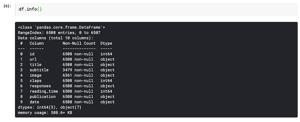
info( ) function
It gives the count of non-null values for each column and its data type: integer, object, or boolean.
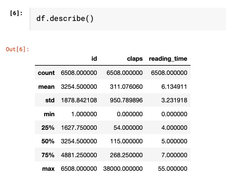
describe( ) function
This function provides basic statistics of each column. By passing the parameter "include = 'all'", it outputs the value count, unique count, top-frequency value of the categorical variables and count, mean, standard deviation, min, max and percentile of numeric variables
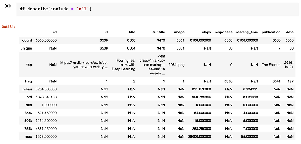
If we leave it empty, it only shows numeric variables. As you can see, only columns being identified as "int64" in the info() output are shown below.
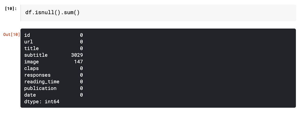
Missing Values
Handling missing values is a rabbit hole that cannot be covered in one or two sentences. If you would love to know more about how to address missing values, here are some articles that may help: How to Address Common Data Quality Issues
In this article, we will focus on identifying the number of missing values. "isnull().sum()" function gives the number of missing values for each column.
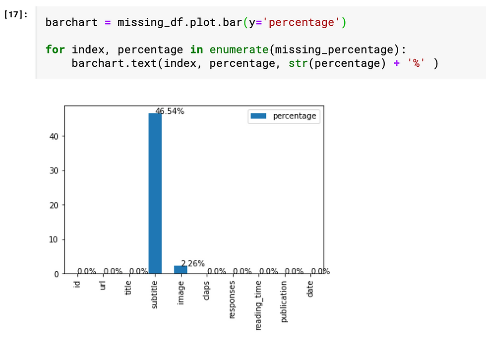
We can also do some simple manipulations to make the output more insightful.
Firstly, calculate the percentage of missing values.

Then, visualize the percentage of the missing value based on the data frame "missing_df". The for loop is basically a handy way to add labels to the bars. As we can see from the chart, nearly half of the "subtitle" values are missing, which leads us to the next step "feature engineering".
2. Feature Engineering
This is the only part that requires some human judgment, thus cannot be easily automated. Don't be afraid of this terminology. I think of feature engineering as a fancy way of saying transforming the data at hand to make it more insightful. There are several common techniques, e.g. change the date of birth into age, decomposing date into year, month, day, and binning numeric values. But the general rule is that this process should be tailored to both the data at hand and the objectives to achieve.
If you would like to know more about these techniques, I found this article "Fundamental Techniques of Feature Engineering for Machine Learning" brings a holistic view of feature engineering in practice.
In this "Medium" example, I simply did three manipulations on the existing data.
1. Title → title_length
df['title_length'] = df['title'].apply(len)As a result, the high-cardinality column "title" has been transformed into a numeric variable which can be further adopted in the correlation analysis.
2. Subtitle → with_subtitle
df['with_subtitle'] = np.where(df['subtitle'].isnull(), 'Yes', 'No')
Since there is a large portion of empty subtitles, the "subtitle" field is transformed into either with_subtitle = "Yes" and with_subtitle = "No", thus it can be easily analyzed as a categorical variable.
3. Date → month
df['month'] = pd.to_datetime(df['date']).dt.month.apply(str)Since all data are gathered from year 2019, there is no point comparing the years. Using month instead of date helps to group data into larger subsets. Instead of doing a time series analysis, I treat the date as a categorical variable.
In order to streamline the further analysis, I drop the columns that won't contribute to the EDA.
df = df.drop(['id', 'subtitle', 'title', 'url', 'date', 'image', 'responses'], axis=1)Furthermore, the remaining variables are categorized into numerical and categorical, since univariate analysis and multivariate analysis require different approaches to handle different data types. "is_string_dtype" and "is_numeric_dtype" are handy functions to identify the data type of each field.

3. Univariate Analysis
After finalizing the numerical and categorical variables lists, the analysis can be automated.
The describe() function mentioned in the first section has already provided a univariate analysis in a non-graphical way. In this section, we will be generating more insights by visualizing the data and spot the hidden patterns through graphical analysis.
Have a read of my article on "How to Choose the Most Appropriate Chart" if you are unsure about which chart types are most suitable for which data type.
Categorical Variables → Bar chart
The easiest yet most intuitive way to visualize the property of a categorical variable is to use a bar chart to plot the frequency of each categorical value.
Numerical Variables → histogram
To graph out the numeric variable distribution, we can use histogram which is very similar to bar chart. It splits continuous numbers into equal size bins and plot the frequency of records falling between the interval.

I use this for loop to iterate through the columns in the data frame and create a plot for each column. Then use a histogram if it is numerical variables and a bar chart if categorical.
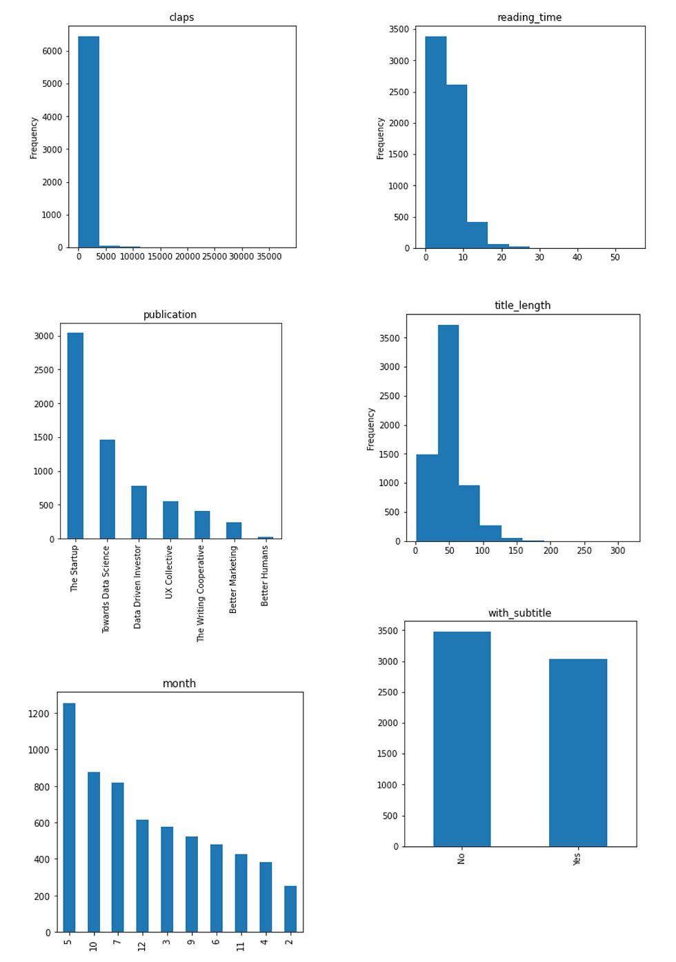
From this simple visualization exercise, we can generate some insights from this specific "Medium" data set:
Most numbers of claps fall into the range between 0 and 5000. However, there must be some outliers with more than 35,000 claps, resulting in a heavily right-skewed graph
The majority of articles have a title with around 50 characters, which may be a result of the SEO suggestions from Medium story setting.

In this sample of data, most articles are from "The Startup" publication and most of the articles are published in May.
4. Multivariate Analysis
Multivariate analysis is categorized into these three conditions to address various combinations of numerical variables and categorical variables.
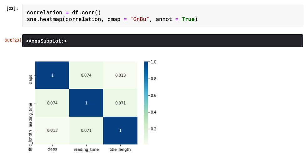
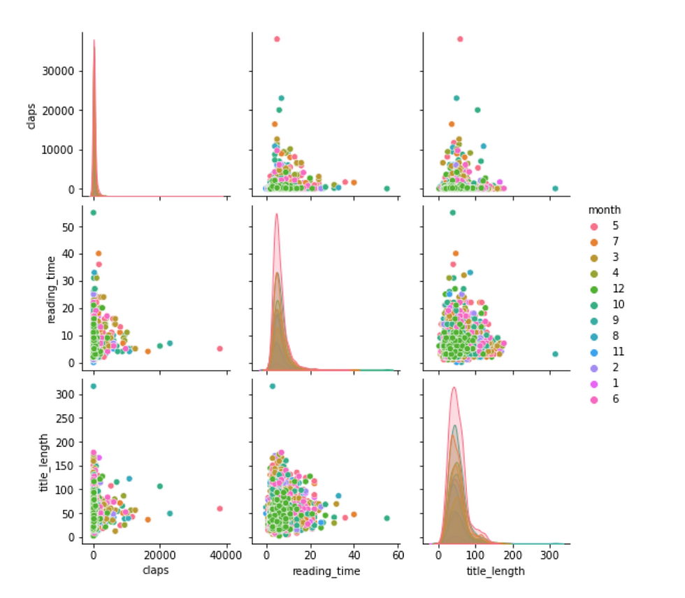
Numerical vs. Numerical → heat map or pairplot
Firstly, let's use the correlation matrix to find the correlation of all numeric data type columns. Then use a heat map to visualize the result. The annotation inside each cell indicates the correlation coefficient of the relationship. Since the coefficient values between any two different columns are all below 0.1, we can confidently say that there is no linear relationship exists.
Secondly, since the correlation matrix only indicates the strength of linear relationship, it is better to plot the numerical variables using seaborn function sns.pairplot(). Notice that, both the sns.heatmap() and sys.pairplot() function ignore non-numeric data type.
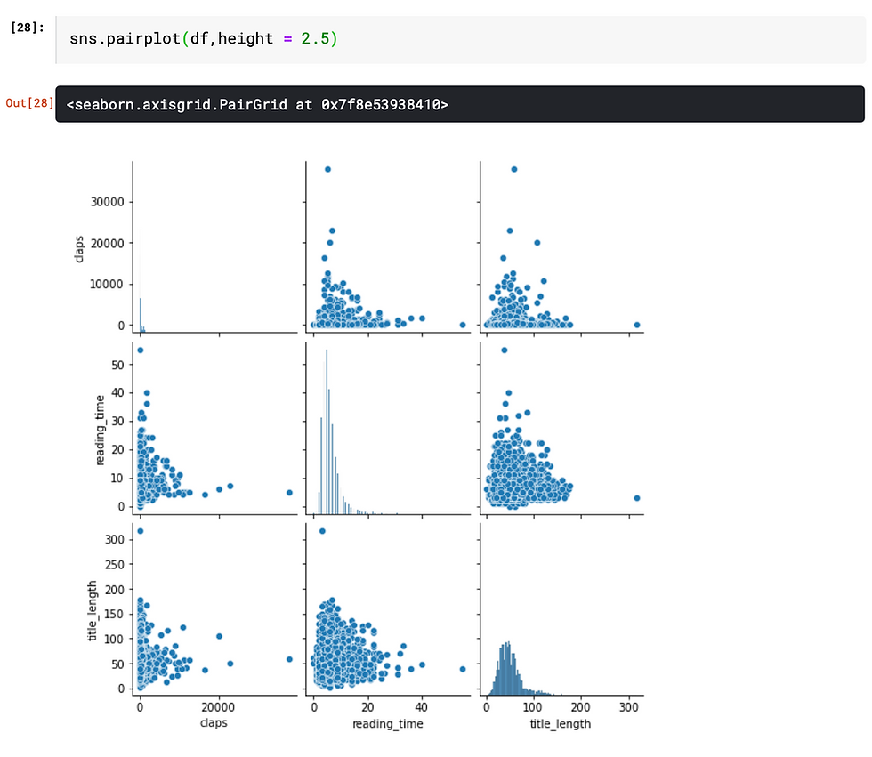
Pairplot or scatterplot is a good complementary to correlation matrix, especially when nonlinear relationships (e.g. exponential, inverse relationship) might exist. However, in this case, there is no clear indication that any potential relationship exists among any pairs. However, this still brings up some questions that might worth investigating, since I would imagine that number of claps would be positively correlated with the reading time.
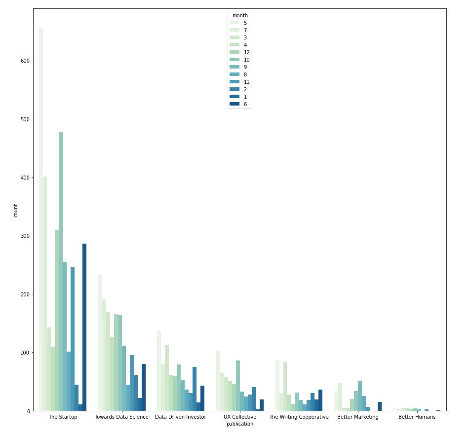
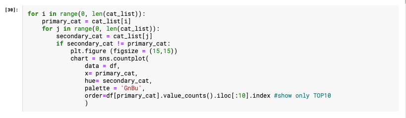
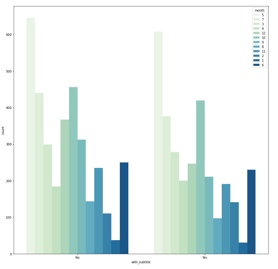
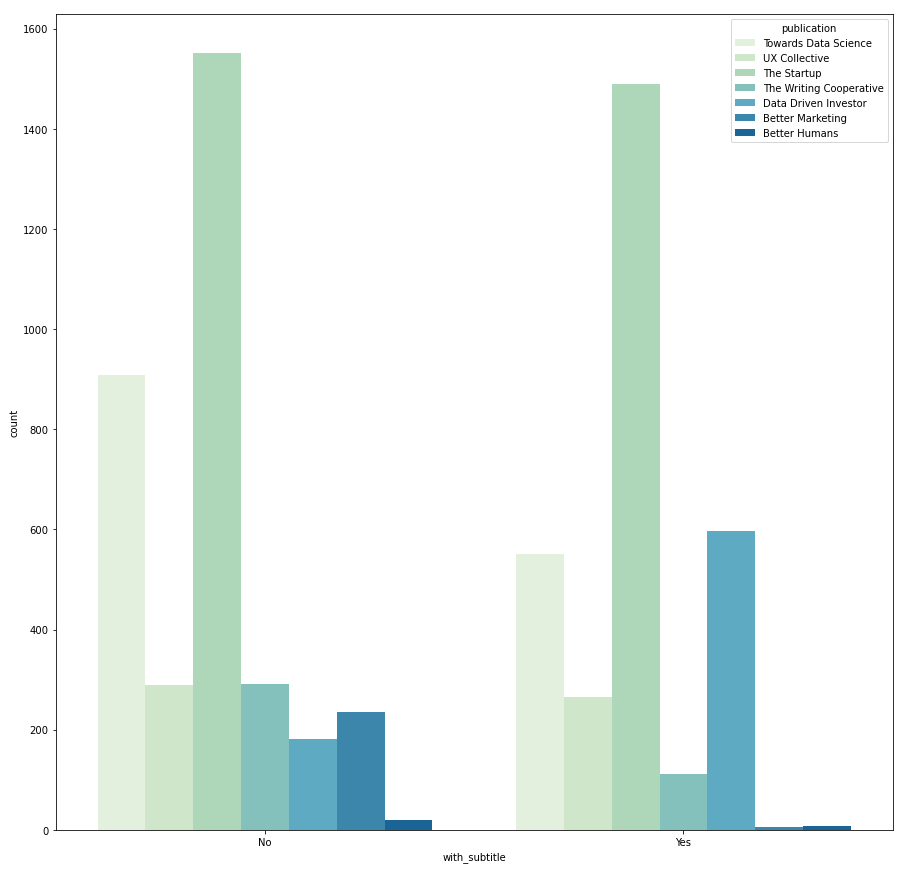
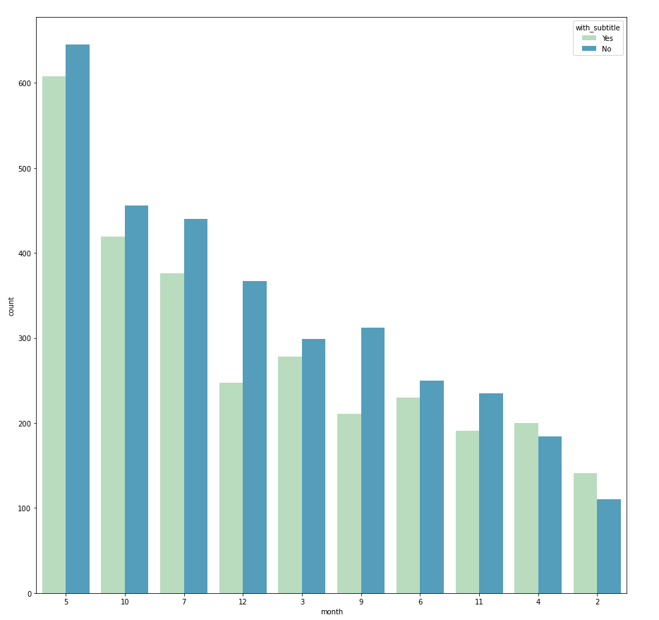
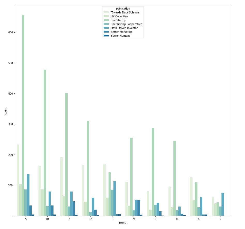
Categorical vs. Categorical → countplot with hue
The relationship between two categorical variables can be visualized using grouped bar charts. The frequency of the primary categorical variables is broken down by the secondary category. This can be achieved using sns.countplot(). Take the example below, in this case the count of primary category "publication" is split using the secondary category "month". And the secondary category is differentiated by hue.
I use a nested FOR loop, where the outer loop iterates through all categorical variables and assigns them as the primary category, then the inner loop iterate through the list again to pair the primary category with a different secondary category.
Within one grouped bar chart, if the frequency distribution always follows the same pattern across different groups, it suggests that there is no dependency between the primary and secondary category. However, if the distribution is different (e.g. with_subtitle vs. publication) then it indicates that it is likely that there is dependency between publication and whether the article has a subtitle. With this in mind, we can further investigate if it is because each publication has different submission rules, for instance, whether the subtitle is compulsory or optional.

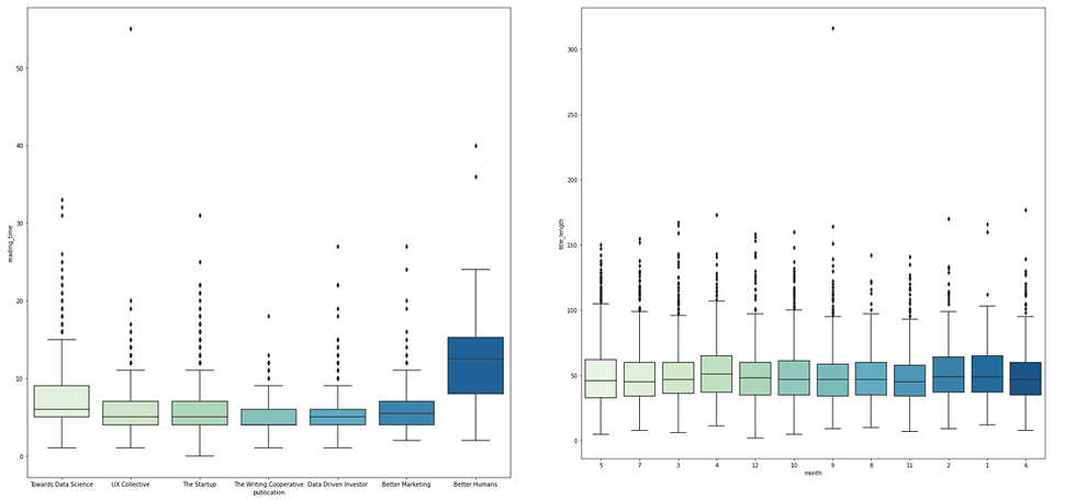
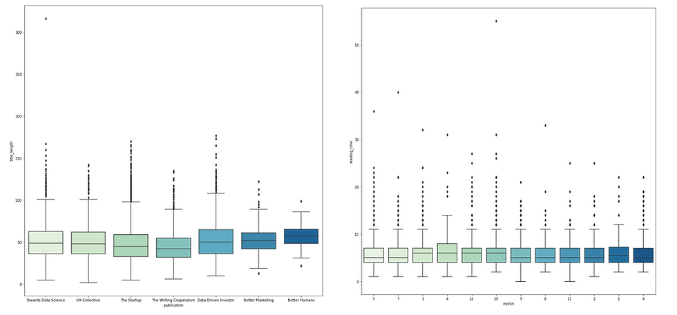
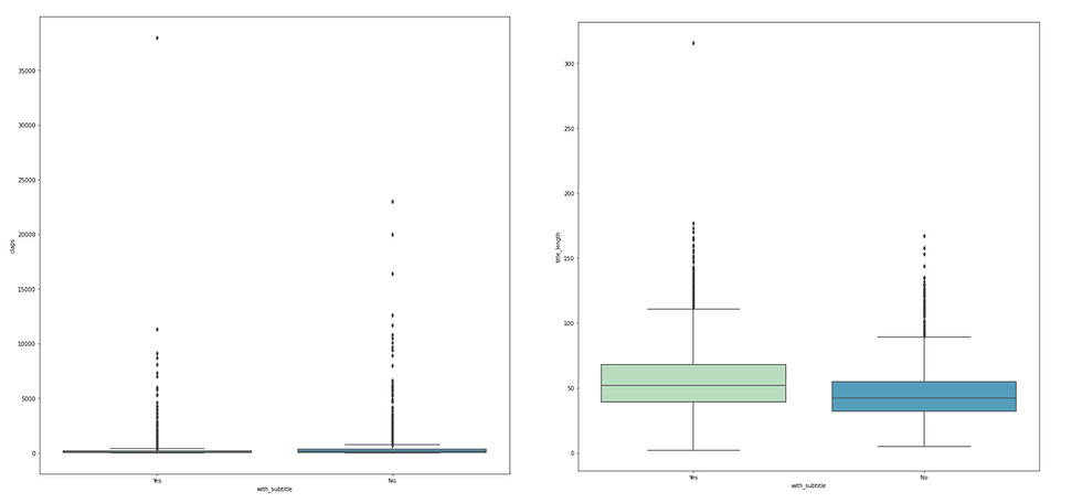
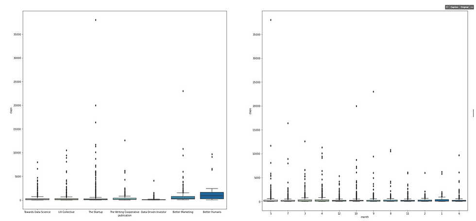
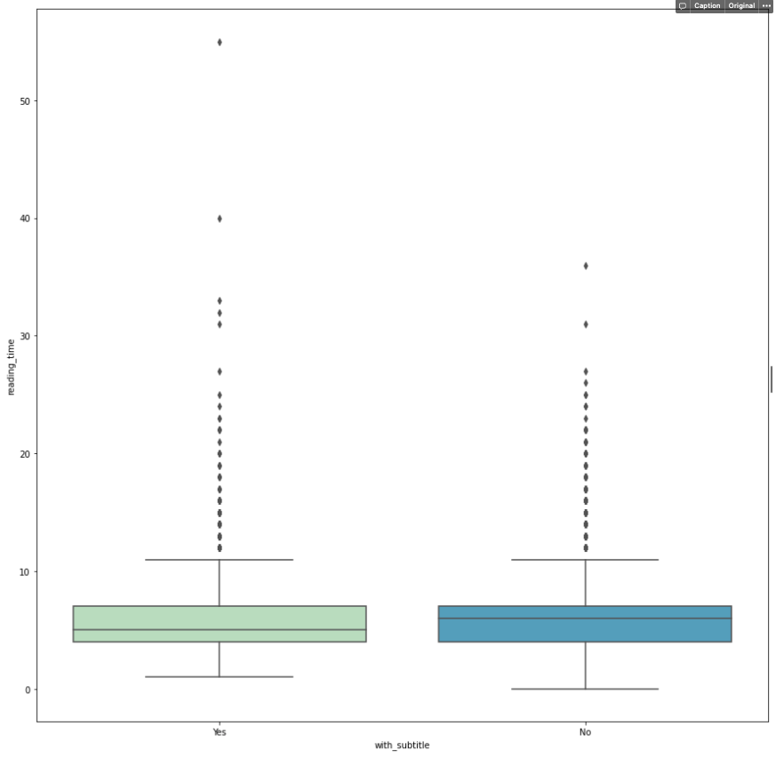
Categorical vs. Numerical → boxplot or pairplot with hue
Boxplot is usually adopted when we need to compare how numerical data varies across groups. It is an intuitive way to graphically depict if the variation in categorical features contributes to the difference in values, which can be additionally quantified using ANOVA analysis. In this "Medium" example, I pair each column in the categorical list with all columns in the numerical list and plot the box plot accordingly.

Among these graphs, one outstanding difference exists in the "reading_time vs. publication" chart suggesting that articles from Better Human publication have longe reading_time on average. This might be something that worth diving into after the EDA phase, or maybe it is just a result of relatively small sample size of Better Human articles.
Another approach is built upon the pair plot that we performed earlier for numerical vs. numerical. To introduce the categorical variable, we can use different hue to represent. Just like what we did for count plot. To do this, we can simply loop through the categorical list and add each element as the hue of the pairplot.
Consequently, it is easy to visualize whether each group forms clusters in the scatterplot. For example in the first chart (hue = month), we can see that month December gathers around the area with fewer claps.

Take-Home Message
This article covers several techniques to perform EDA:
Know Your Data: have a bird's view of the characteristics of the dataset.
Feature Engineering: transform variables into something more insightful.
Univariate Analysis: 1) histogram to visualize numerical data; 2) bar chart to visualize categorical data.
Multivariate Analysis: 1) Numerical vs. Numerical: correlation matrix, scatterplot (pairplot); 2) Categorical vs. Categorical: Grouped bar chart; 3) Numerical vs. Categorical: pairplot with hue, box plot.
Feel free to grab the code here. As mentioned earlier, other than the feature engineering part, the rest of the analysis can be automated. However, it is always better when the automation process is accompanied by some human touch, e.g. experiment on the bin size to bring more valuable insights.
import pandas as pd
import seaborn as sns
import matplotlib.pyplot as plt
import numpy as np
from pandas.api.types import is_string_dtype, is_numeric_dtype

df = pd.read_csv('/Independence100.csv')
print(df.head(5))

### 1. Know Your Data ###
df.info()
df.describe()

# missing values #
missing_count = df.isnull().sum() # the count of missing values
value_count = df.isnull().count() # the count of all values
missing_percentage = round(missing_count / value_count * 100,2) #the percentage of missing values
missing_df = pd.DataFrame({'count': missing_count, 'percentage': missing_percentage}) #create a dataframe
print(missing_df)

# visualize missing value#
barchart = missing_df.plot.bar(y='percentage')
for index, percentage in enumerate(missing_percentage):
    barchart.text(index, percentage, str(percentage) + '%' )


### 2. Feature Engineering ###

# adding title_length
df['title_length'] = df['title'].apply(len)

# extracting month from date
df['month'] = pd.to_datetime(df['date']).dt.month.apply(str)

# whether the article has subtitle
df['with_subtitle'] = np.where(df['subtitle'].isnull(), 'Yes', 'No')

# drop unnecessary columns
df = df.drop(['id', 'subtitle', 'title', 'url', 'date', 'image', 'responses'], axis=1)

# populate the list of numeric attributes and categorical attributes
num_list = []
cat_list = []

for column in df:
 if is_numeric_dtype(df[column]):
        num_list.append(column)
 elif is_string_dtype(df[column]):
        cat_list.append(column)

print(num_list)
print(cat_list)


### 3. Univaraite Analysis ###

# bar chart and histogram
for column in df:
    plt.figure(column, figsize = (4.9,4.9))
    plt.title(column)
 if is_numeric_dtype(df[column]):
        df[column].plot(kind = 'hist')
 elif is_string_dtype(df[column]):
 # show only the TOP 10 value count in each categorical data
        df[column].value_counts()[:10].plot(kind = 'bar')


### 4. Multivariate Analysis ###

# correation matrix and heatmap
correlation = df.corr()
sns.heatmap(correlation, cmap = "GnBu", annot = True)

# pairplot
sns.pairplot(df,height = 2.5)

# grouped bar chart
for i in range(0, len(cat_list)):
    primary_cat = cat_list[i]
 for j in range(0, len(cat_list)):
        secondary_cat = cat_list[j]
 if secondary_cat != primary_cat:
            plt.figure (figsize = (15,15))
            chart = sns.countplot(
                data = df,
                x= primary_cat,
                hue= secondary_cat,
                palette = 'GnBu',
                order=df[primary_cat].value_counts().iloc[:10].index #show only TOP10
              )

# pairplot with hue
for i in range(0, len(cat_list)):
    hue_cat = cat_list[i]
    sns.pairplot(df, hue = hue_cat)

# box plot
for i in range(0, len(cat_list)):
    cat = cat_list[i]
 for j in range(0, len(num_list)):
        num = num_list[j]
        plt.figure (figsize = (15,15))
        sns.boxplot( x = cat, y = num, data = df, palette = "GnBu")


Comments